
How Menu Layout and Typography Shape Customer Decisions
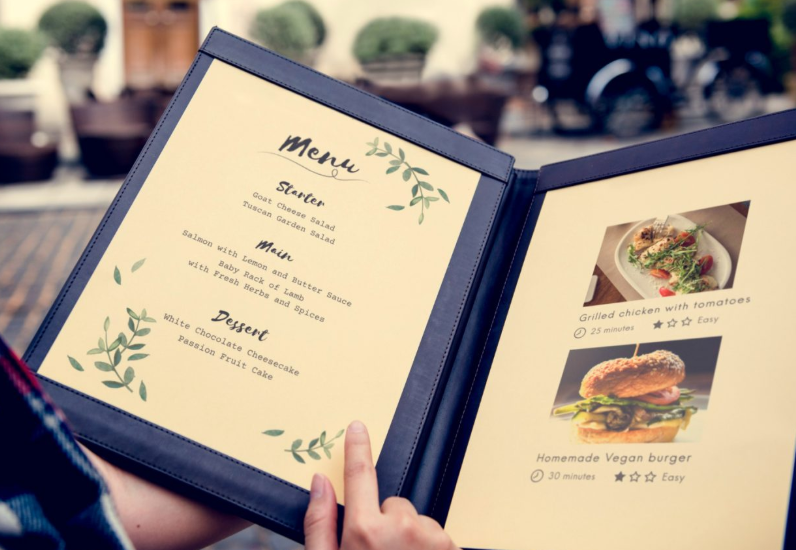
When customers sit down at a restaurant, the menu becomes more than a list of dishes. It’s the first real interaction they have with your brand. Before food arrives, before service is judged, the menu quietly sets expectations. Its layout, structure, and readability all influence how comfortable customers feel—and what they’re most likely to order.
Many restaurant owners focus heavily on recipes and pricing but overlook presentation. Yet visual clarity can significantly impact decision-making. Even small design choices, like font size or spacing, can determine whether a dish stands out or gets ignored.
That’s why more food businesses are paying attention to typography and layout tools, including options like a text logo maker, to maintain consistent branding across menus, signage, and digital platforms. When visual elements align, customers experience the menu as intentional rather than overwhelming.
Why Menus Are Psychological Tools
Menus subtly guide behavior. Customers don’t read them line by line—they scan. Their eyes move in predictable patterns, gravitating toward areas that feel visually lighter or more organized.
Well-structured menus help guests feel confident. When choices are clear, ordering becomes easier. When layouts are cluttered, customers hesitate, feel rushed, or default to familiar options instead of exploring.
Typography and Readability Matter More Than Style
Fancy fonts may look appealing, but if they slow down reading, they work against the menu’s purpose. Legibility should always come first.
Good menu typography:
- Uses clear, readable fonts
- Maintains consistent sizing for categories
- Avoids excessive italics or decorative scripts
- Balances character spacing for comfort
The easier a menu is to read, the more enjoyable the dining experience becomes.
Visual Hierarchy Drives Attention
Hierarchy helps customers understand what’s most important. Section headers, spacing, and subtle emphasis guide the eye naturally.
For example:
- Category titles should stand out clearly
- Featured items can be highlighted without being aggressive
- Descriptions should be easy to skim
When everything is emphasized, nothing feels special. Strategic restraint makes standout items more effective.
Common Menu Design Mistakes
Many menus suffer from the same issues:
- Too many font styles competing for attention
- Overcrowded pages trying to fit every option
- Inconsistent alignment that feels chaotic
- Poor contrast that strains the eyes
These problems don’t just affect aesthetics—they impact ordering speed and satisfaction.
See also: The Future of UX Technology
Small Changes With Big Impact
You don’t need a full redesign to improve a menu. Simple adjustments can make a noticeable difference:
- Increase line spacing between items
- Reduce the number of font variations
- Group similar items logically
- Use white space to separate sections
These changes help customers feel more relaxed and in control.
Menus as an Extension of Brand Identity
A menu should feel like a natural extension of the restaurant itself. A casual café and an upscale dining experience shouldn’t look the same—and customers notice when visuals match the atmosphere.
Consistency between menus, signage, and online presence reinforces professionalism and trust. When everything feels aligned, the brand feels stronger.
Conclusion
Menus quietly shape how customers experience a restaurant. Clear typography, thoughtful layout, and visual balance don’t just improve aesthetics—they make decisions easier and experiences more enjoyable.
By treating menu design as part of the overall customer journey, restaurants can guide attention naturally, reduce friction, and create a dining experience that feels effortless from the very first glance.